
Let’s get straight to the point. If your buyers are looking to purchase something, they want to find that product, know some product and shipping details then just complete the checkout process to get that product in their hands. It is understood that to improve user experience of eCommerce website means – you get to sell more and sell quickly. So don’t make your customers beat around the bush, help them to get what they want. How?
Here are some secret tips to improve the user experience of your eCommerce site to increase your conversions and keep customers coming back for more.
Ecommerce User Experience Best Practices for Homepage
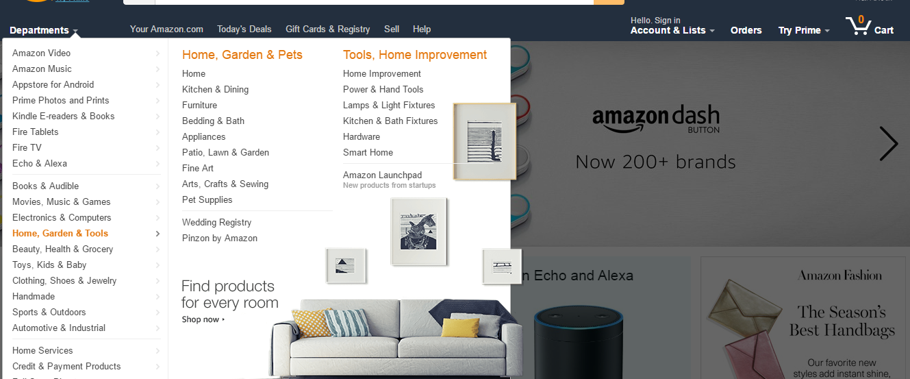
Let’s take it from the market leaders. Look at the homepage of Amazon.com, eBay or Etsy. What are the common points?
- These are all image driven, there’s no place for unnecessary text and those which are there are clearly visible and understood.
- The images that are used are of high quality and make sure to have the right proportion of white spaces.
- A specific place for promotion – Today’s Deal and Daily Deal exists on both Amazon and eBay.
- You can’t miss noticing the clear and visible Search Bar on Amazon, eBay or Etsy.
- Departments or Categories, appropriate categorization of your product type is a must.
- The sub-categories are presented in dropdown but they are not using single column to make more findable.
- The homepage of Amazon and eBay includes product level promotion but they don’t overdo it.
- Category or product specific promotion offer is displayed only after it is triggered by user.
These are the merchant places and we have been accustomed to buying from them. It doesn’t necessarily mean that copying the exact design will get us the same results, but taking note of useful features can really help to provide a better customer experience.
You could showcase products on your homepage based on the season, like if you are selling apparels, you could display boots, jackets and such during winter and likewise during summer. This is best placed under the Featured Category tab if you have this section.
The next point is that the visitors should not reach the footer section of your homepage rather find the product they are searching before that and continue to the checkout page. But, this doesn’t reduce the importance of the footer menu. It is really practical to use the footer menu to provide easy navigation options.
Where the top navigation and homepage is entirely dedicated to promoting or selling your products, you can make the best use of footer part for promoting your business through partnership, provide information about pick-up centers in different countries or your refund and terms of usage policies.
User Experience focus on Product Details Page
If you successfully drove the customer to your product details page within one or two clicks, you have made a great achievement, if not; this should be your priority. Now let’s take a look into what makes a great product details page and what you should not miss:
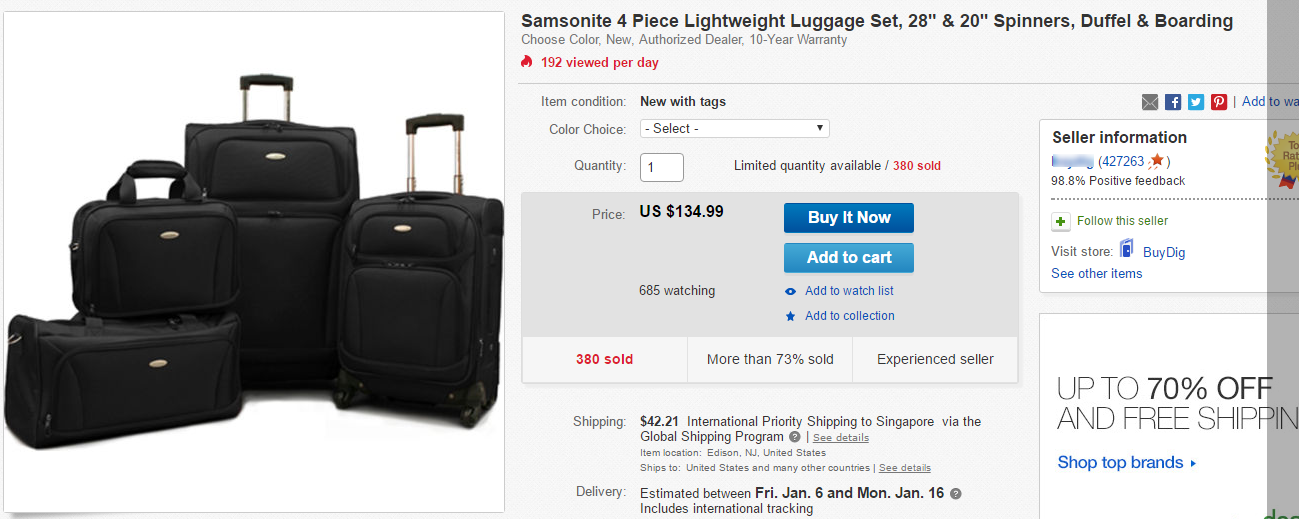
While taking a look into the Amazon and eBay product pages, though they seem to be cluttered with information, they haven’t missed the points that are necessary. Let’s take a closer look on the information provided by these merchants.
 Product Title: These merchants have provided the product title with specific information about the product. It leaves no room for confusion here. Likewise, it is a good practice for you to follow the product titles that are clearly understood by buyers globally. Take a test to search for your suggested product title – search it on google and check if the same product comes up at top.
Product Images: These merchants have provided a clear option for multiple images to represent all angles of product. Amazon provides a product image zoom feature when the image size is of 1000px. It is better to maintain product image consistency for the images on your site as well.
Product Variations & Attributes: You can’t afford to hide or make the product attributes confusing. That is totally a conversion killer. Also, you should list the variations clearly. An easy way to choose from among the variations is compulsory. For this, a dropdown will serve the purpose best way like it is done in eBay.
Shipping Information: If you are offering shipping free for certain items, highlight this point. Or if you have been able to create collection points at different locations, you can integrate the Google maps to point out locations. One absolutely must take action is that you need to let your users know how long they have to wait. Immeditely send out the information about a product is shipped, this is not where you should delay.
 Customer Reviews: Displaying product rating based on star system or providing the reviews of your customer will add the social proof for the product. This is implemented by both Amazon and eBay. Whether you are selling on these platforms or from your eCommerce site, don’t forget to send an email to your customers to ask for a review.
Bullet Description: The importance of description on bullet points is more as the competition grows. These increase the readability factor. It’ll also help the visitors to quickly decide if your product is what they are really searching for.
Business Ratings: It is a sign and a reason to trust your online store if you have A grading from Better Business Bureau. But a better sign of trust for eCommerce site can be gained by acquiring the Google Trusted Store badge on your site. Also, don’t forget to mention clearly about the product refund policy on your product details page.
Provide Payment options: We all have our preferences. And when it is about payment, many people are skeptic. So, in order to make sure you don’t lose any sales, provide your customers with multiple payment options.
 Call to Action: Make sure that your call to action button is visible and is simple enough but appealing. Even the Buy Now button works really well when it is driven and tested for conversion. If you haven’t followed conversion testings on your call to action then probably you should now after following the other tips.
Product Suggestions: Most of the successful ecommerce sites implement the product suggestions based on products added to the wishlist or added to the cart for cross sell or upsell. This is a really good idea. Also if you can implement the products that were viewed some time back, this will also add to the user experience points.
We know you must be waiting for more information about the shopping cart and sales funnel. But before that, we recommend you to check these eCommerce promotion ideas. We will soon share information about those as well. If you have more tips regarding user experience tips then feel free to write to us.


